Banking on Good Design
Creative Direction · Graphic Design · Print Design · Advertising · Campaign Design
Banking might not be the first place you'd expect to have a little fun with design—but that's exactly what made working with Reliabank interesting.
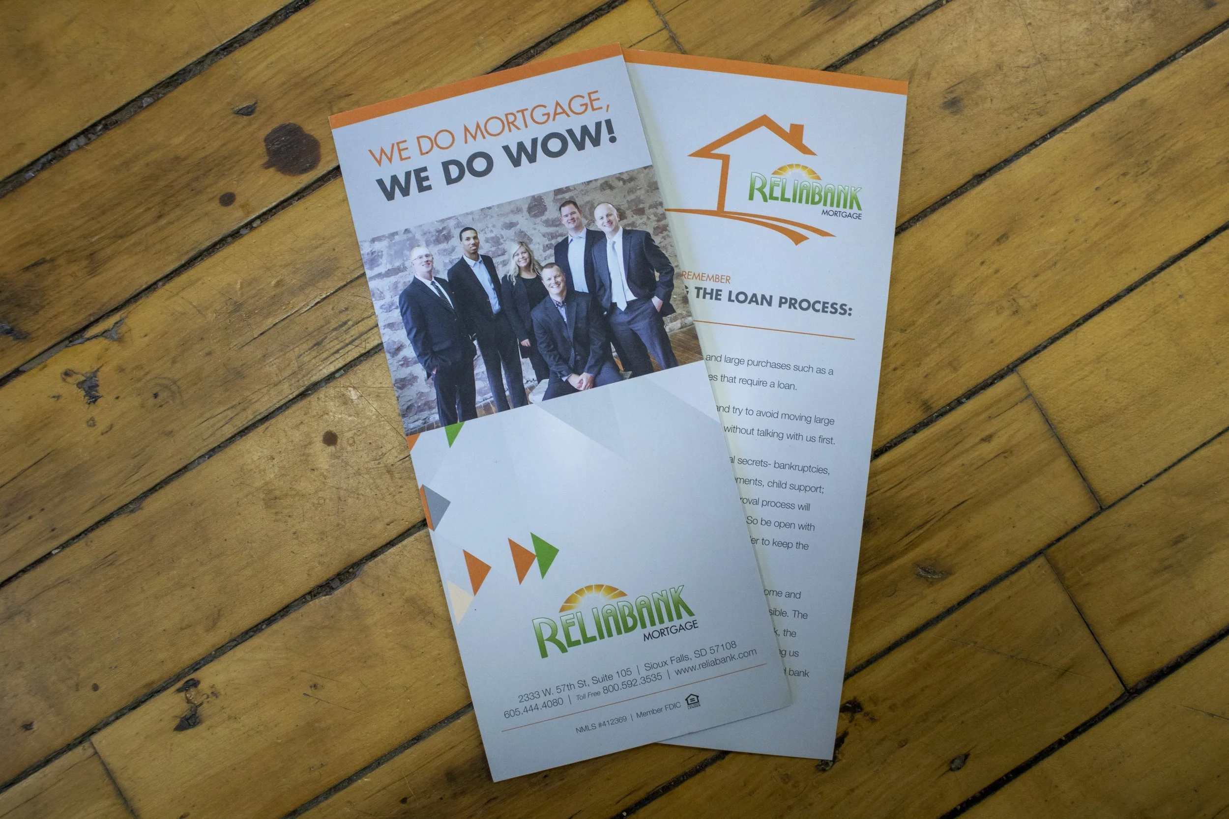
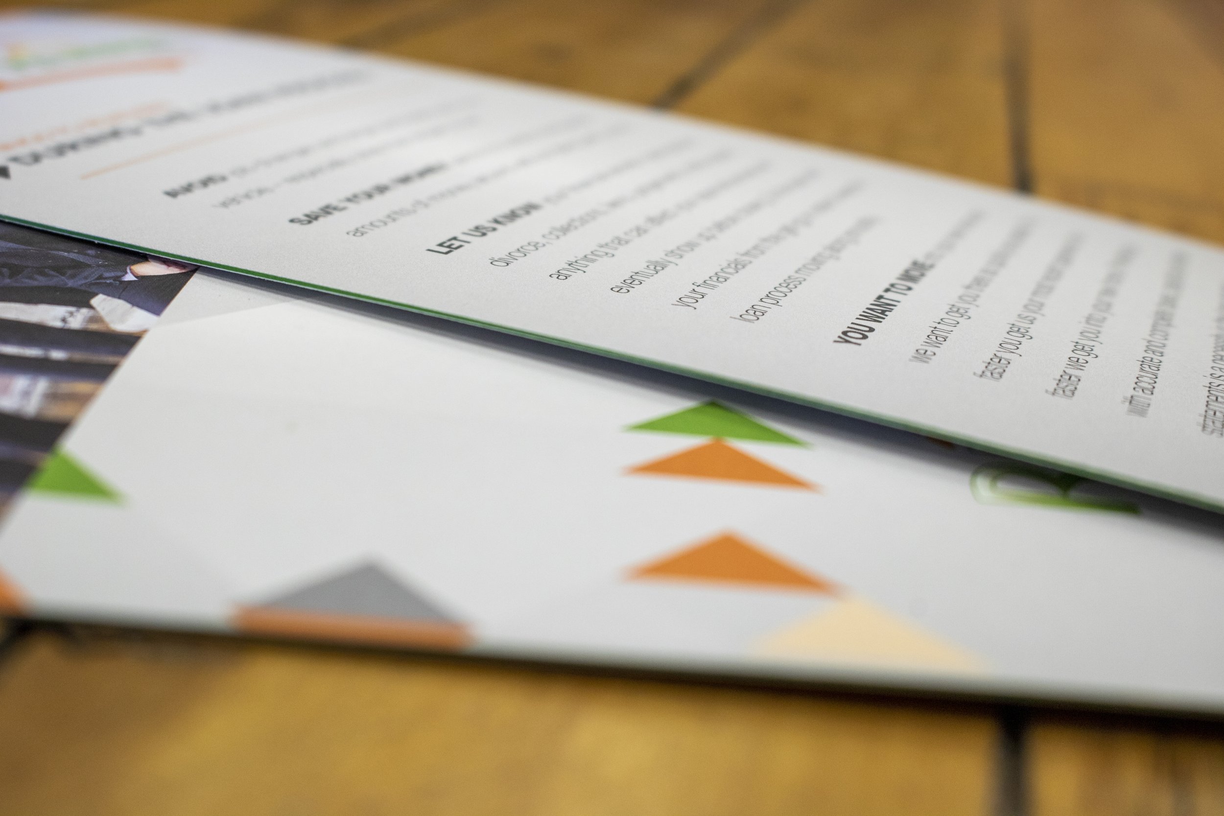
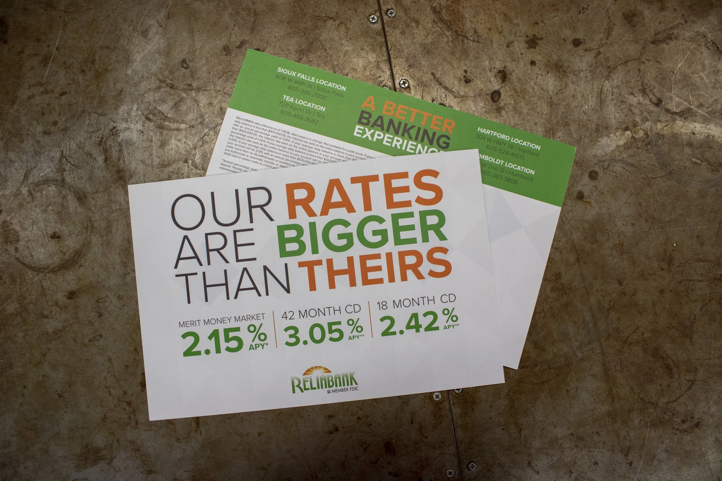
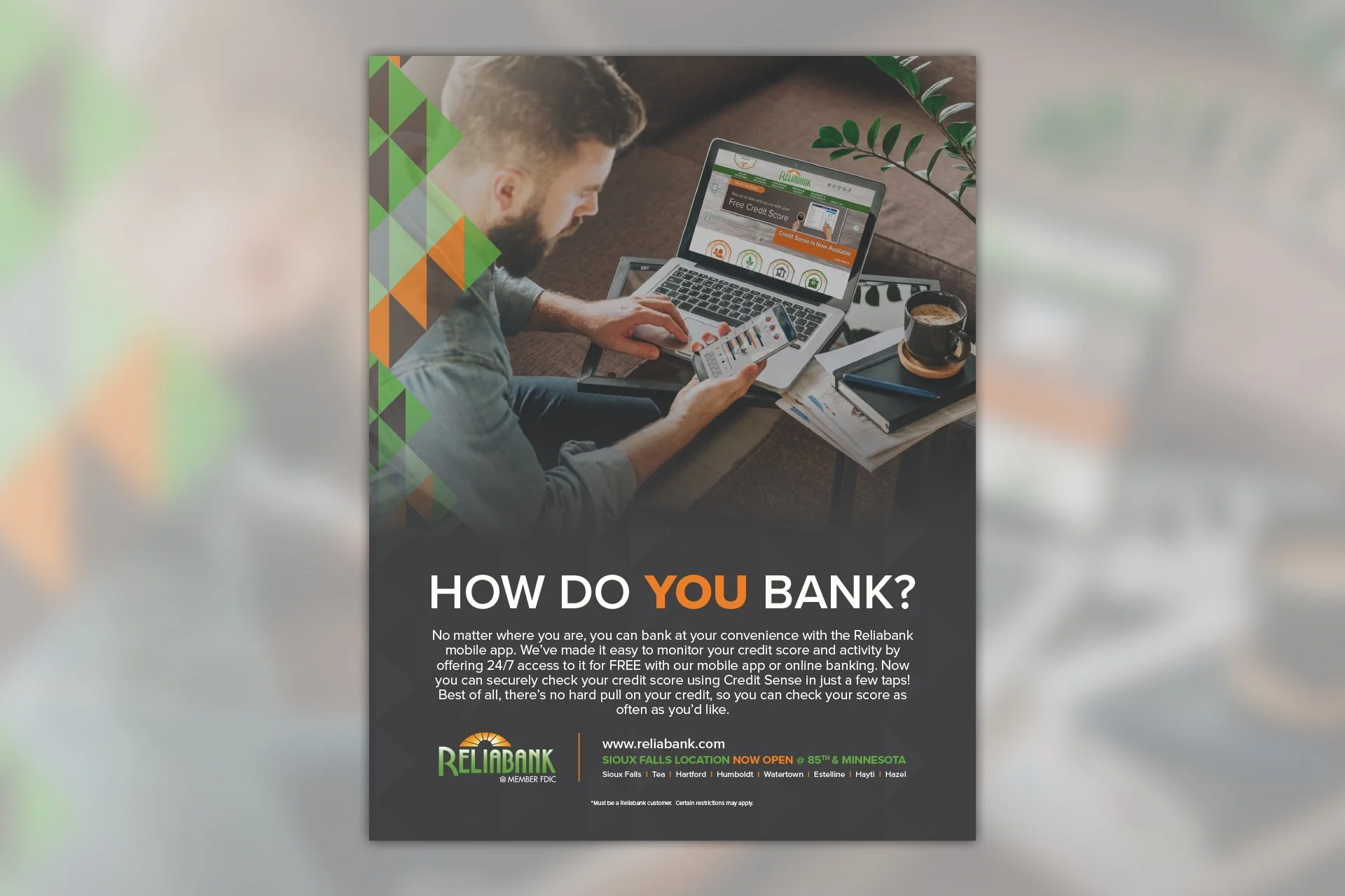
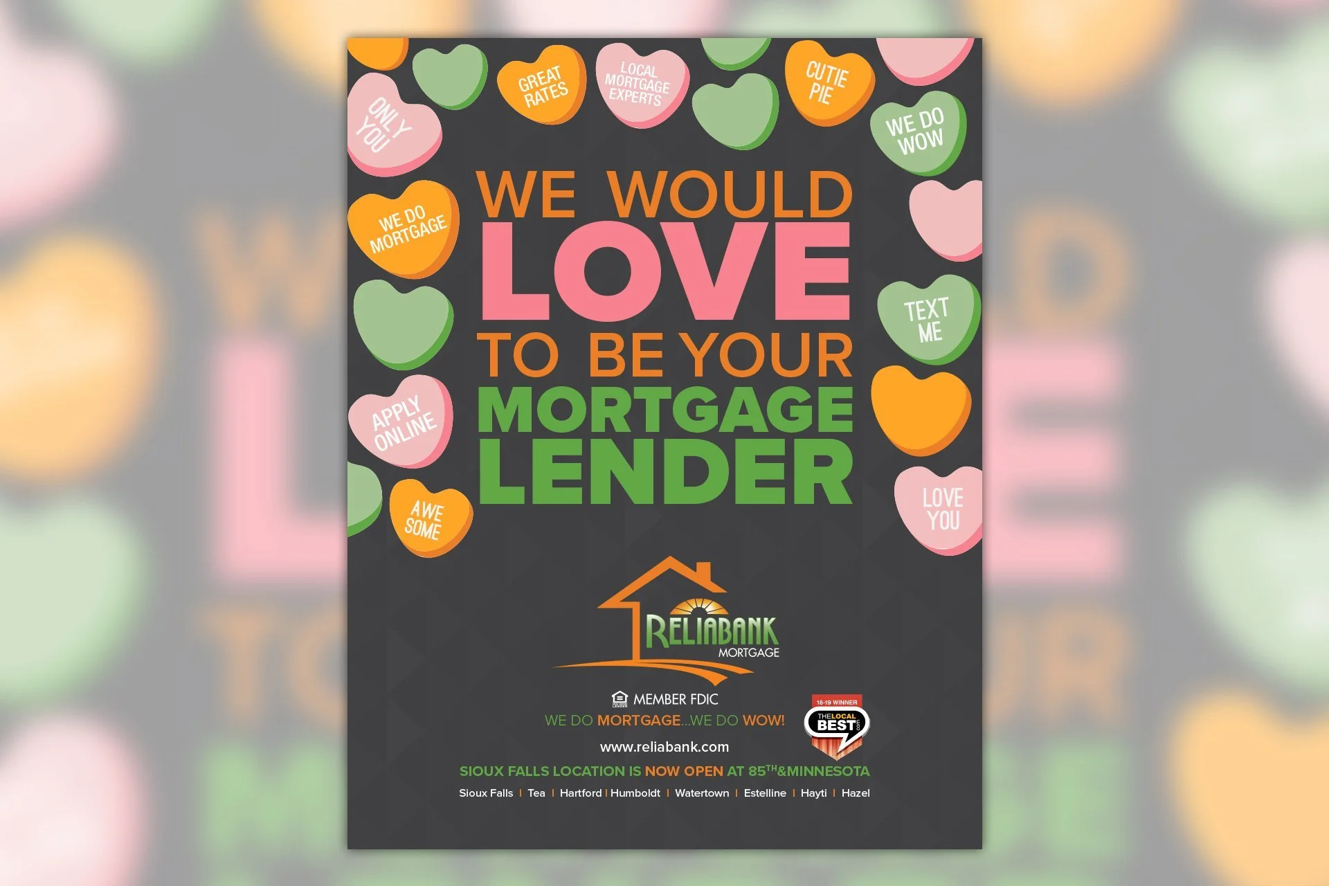
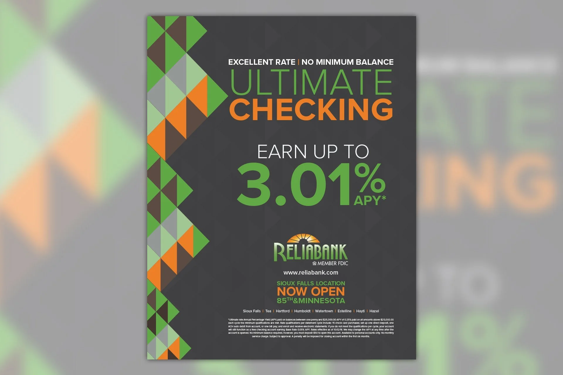
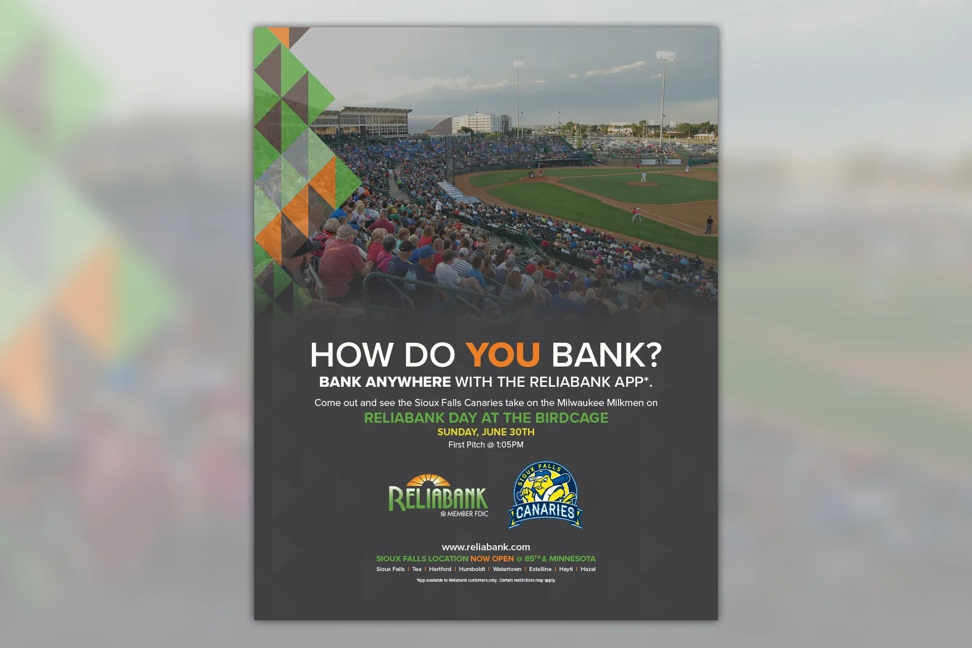
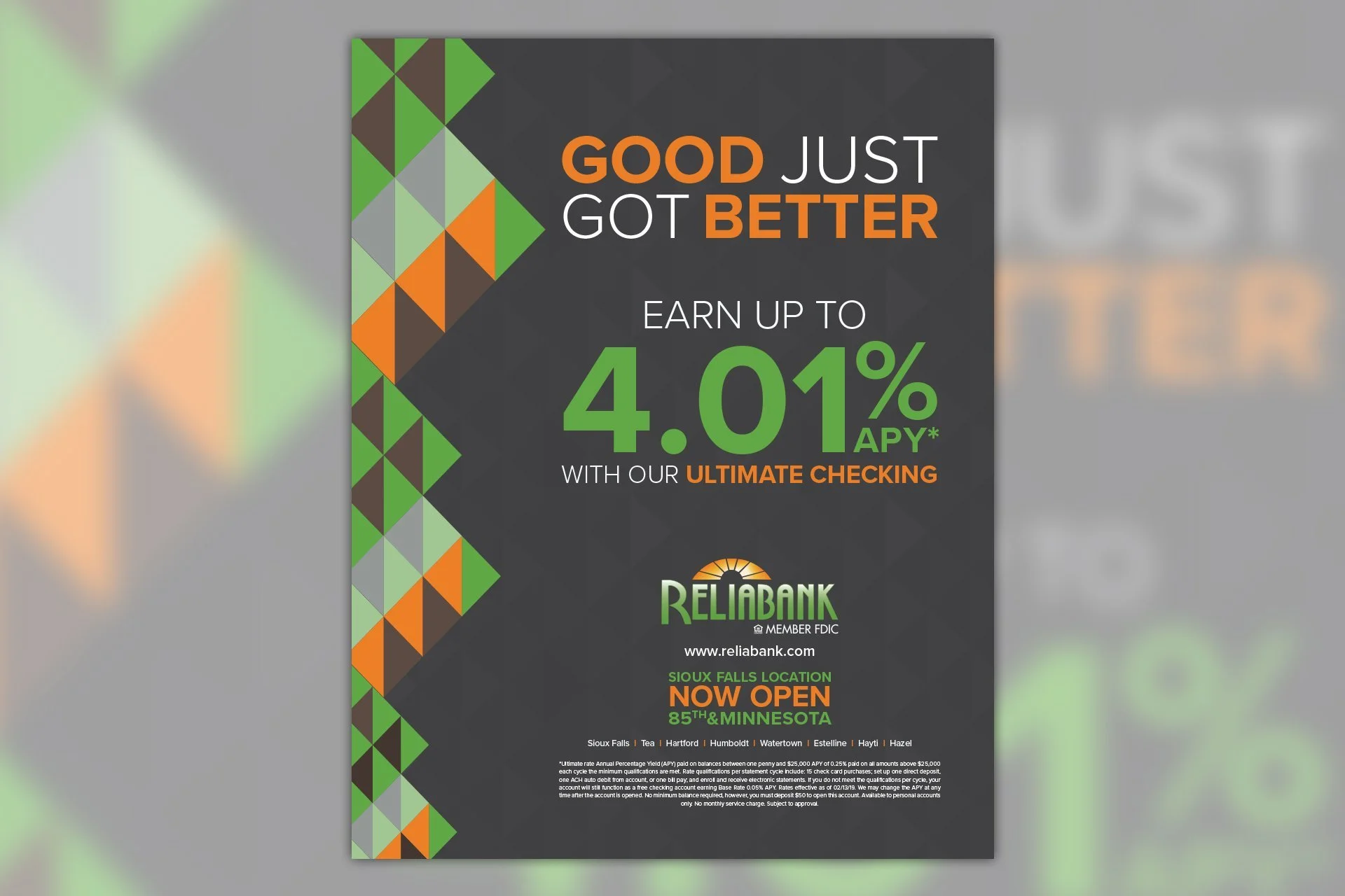
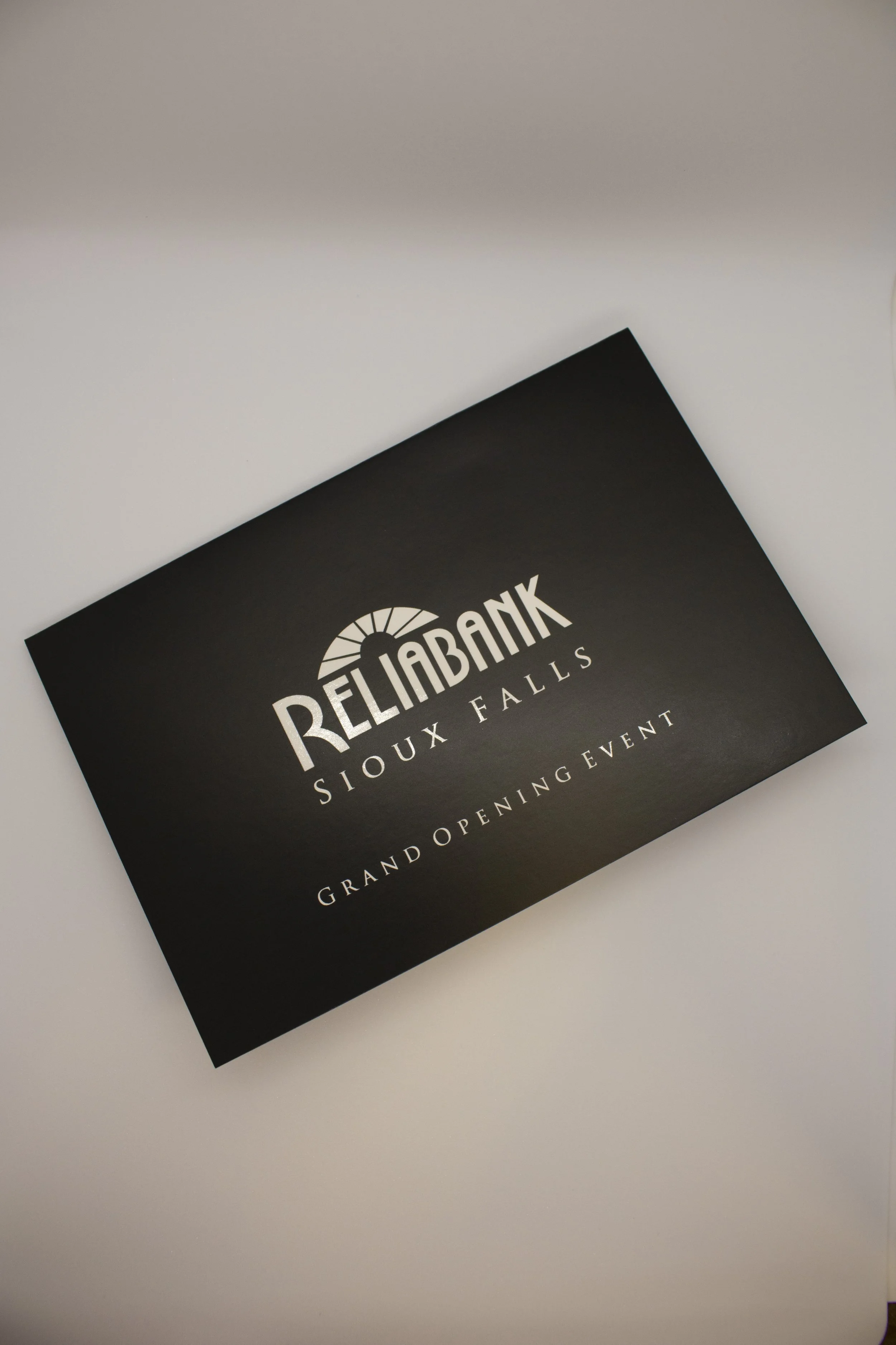
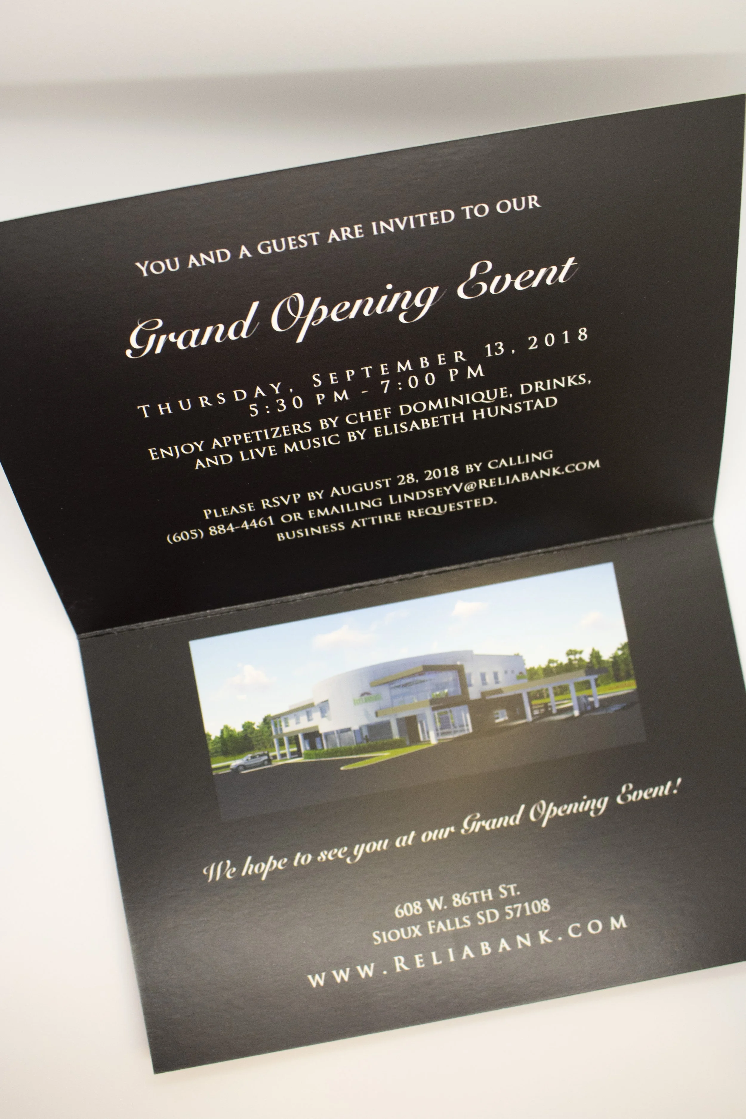
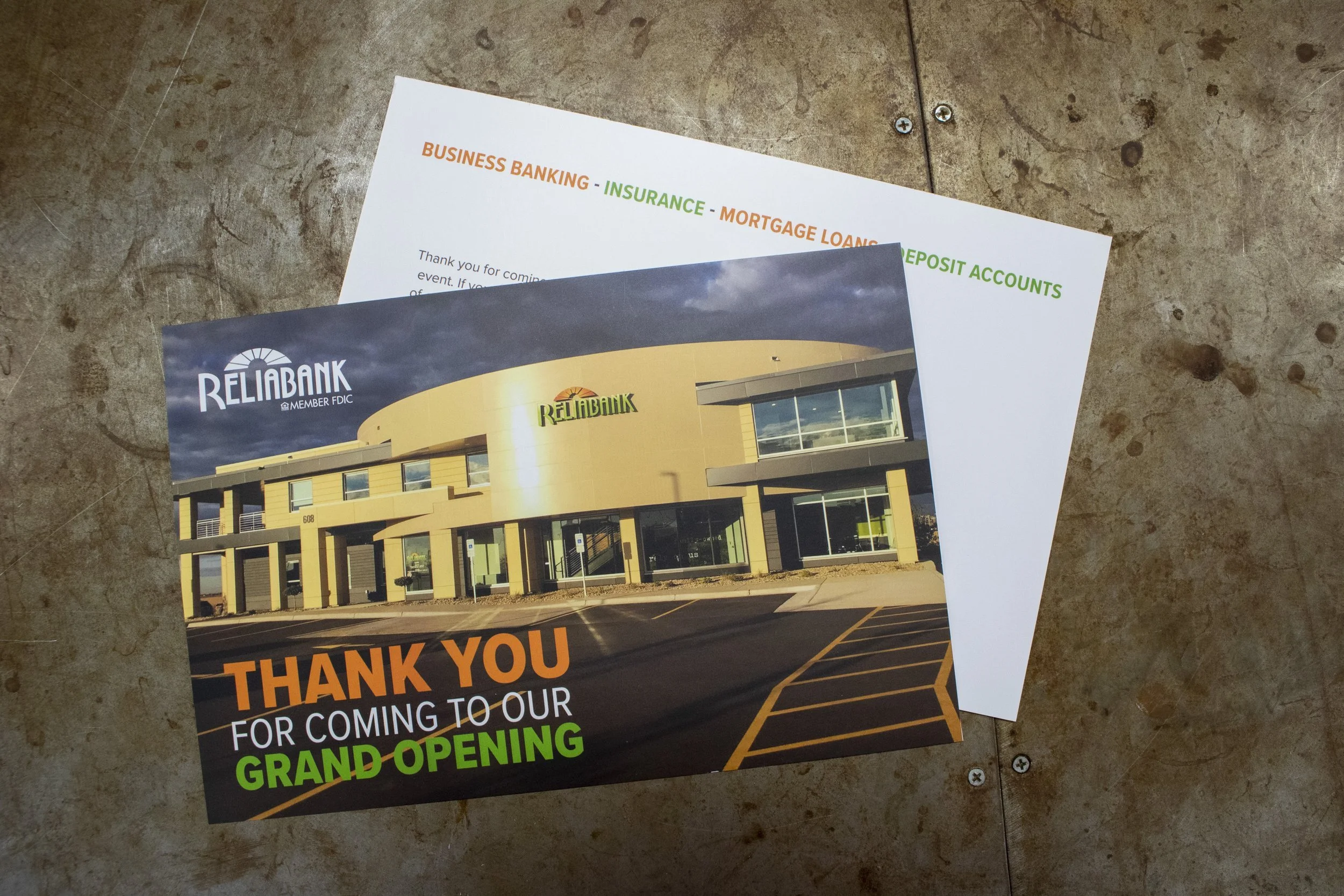
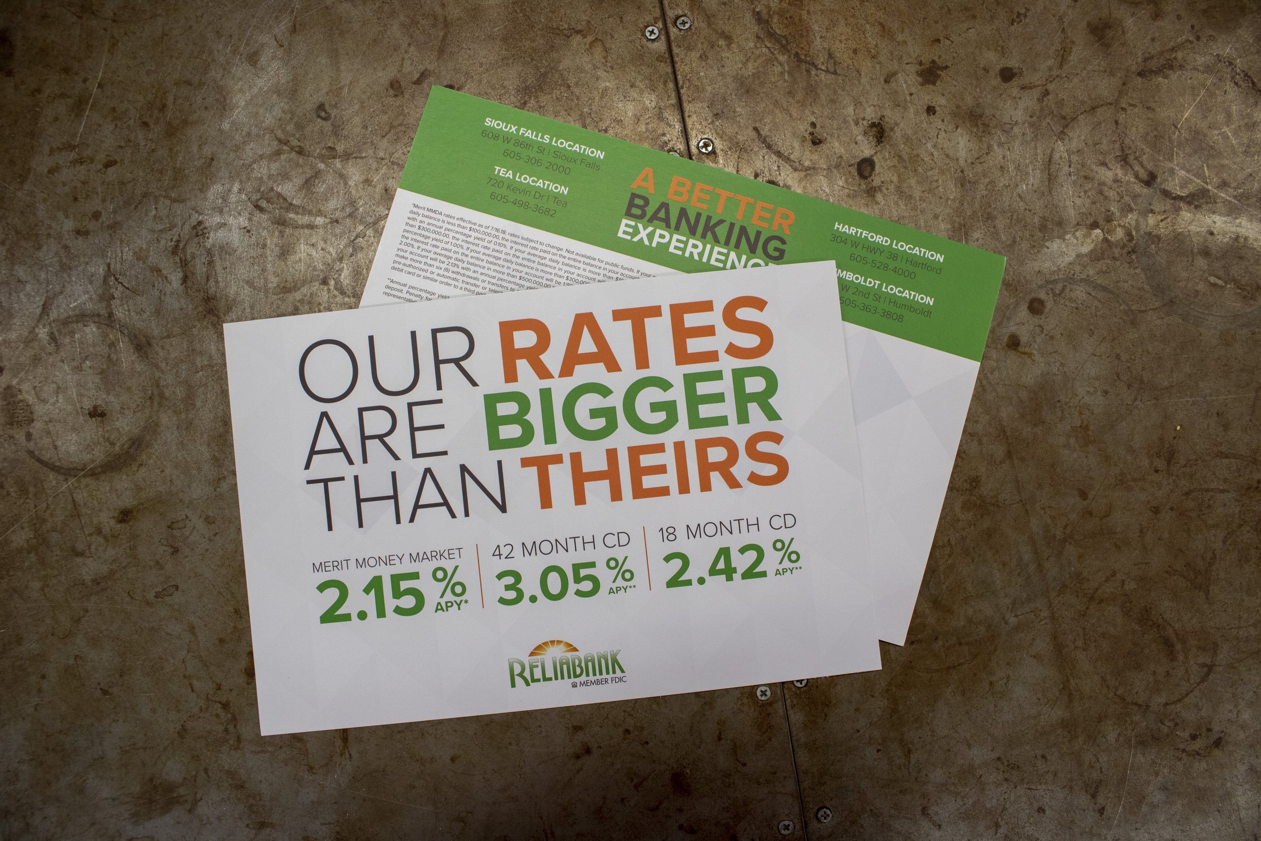
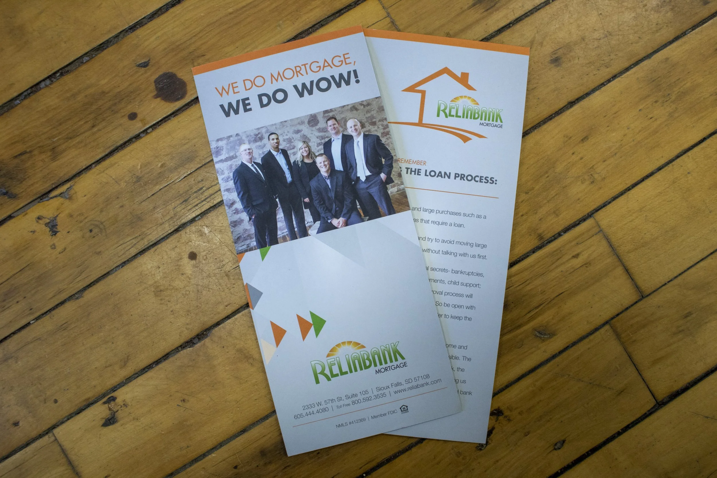
While at Ripple Marketing, I created a range of print and advertising materials for Reliabank, carrying their established identity across everything from everyday branded pieces to magazine advertising and grand-opening creative.
One Brand, Plenty to Work With
Working with Reliabank wasn't about creating something new every time. It was about finding new ways to use an established visual language while keeping everything recognizable, consistent, and appropriate for the job at hand.
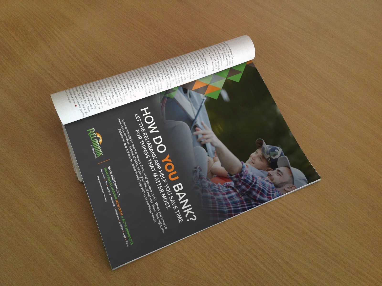
That included a series of print advertisements for 605 Magazine, with new creative developed throughout the year. Each ad needed to stand on its own while still feeling connected to the larger campaign and unmistakably Reliabank.
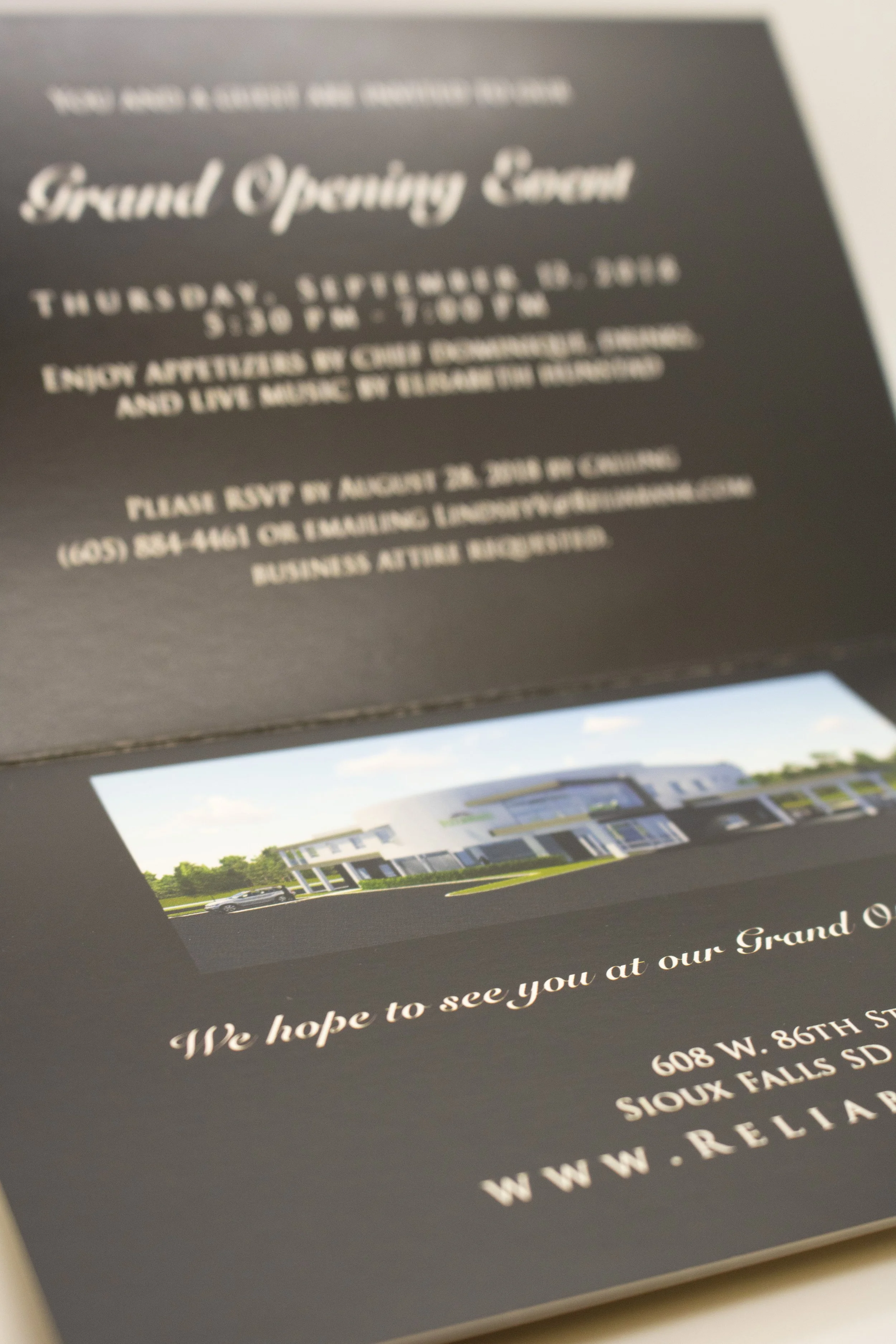
The work also extended to branded print materials and creative for the opening of a new Reliabank location. For the grand opening, the visual direction needed a little extra energy—something that could celebrate the new location and grab attention without feeling disconnected from the larger brand.
Across each piece, I worked with typography, color, imagery, and layout to adapt the Reliabank identity to different audiences, formats, and messages.
Together, the projects show one of my favorite challenges in brand design: keeping things consistent without making everything look the same.
Created while at Ripple Marketing.